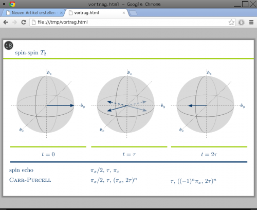
When preparing presentations with sozi, you define all frames, viewports and transitions with respect to one defined aspect ratio. Unfortunately, sometimes the aspect ratio of the screens or beamers actually used for the presentation is unknown at this stage. Moreover, if you’re supposed to repeat your talk, you might not want to edit the vector graphic file just to accommodate the different setups.

As you can see in the image above, keeping the aspect ratio is a good opportunity for adding some eye candy. So what to do?
- Copy the template into some local file (.htm or .html) and adjust the three configuration lines.
- Copy your presentation to a folder matching your definition of the variable source.
- Open the HTML file with your favourite browser. I personally recommend chrome, as the SVG rendering is quite fast.
- Keep the focus on the inner part, that is avoid clicking at the shaded background. (Technical explanation at the end.)
- Amaze your audience.
Here’s the template:
<html>
<head>
<script type="text/javascript">
/* configuration */
var aspect = 1.6; // width / height
var source = 'Vortrag.svg';
var margin = 20;

/* code */
function resize() {
    rw = window.innerWidth;
    rh = window.innerHeight;
    sw = 0;
    sh = 0;
    ratio = rw/rh;
    if (ratio > aspect) {
        sh = rh-margin;
        sw = sh*aspect;
    } else {
        sw = rw-margin;
        sh = sw/aspect;
    }
    document.getElementById('sozi').height = sh;
    document.getElementById('sozi').width = sw;
    document.getElementById('sozi').style.margin = (rh-sh)/2 + 'px ' + (rw-sw)/2 + 'px';
    document.getElementById('sozi').contentWindow.focus();
}
function addsozi() {
    document.getElementById('sozi').src = source;
    window.onresize = resize;
}
</script>
<style media="screen" type="text/css">
body {
    margin: 0px;
    padding: 0px;
    text-align: center;
    background: #bbb;
}
iframe {
    background: white;
    border: 0px;
    -moz-box-shadow: 0 0 5px 5px #888;
    -webkit-box-shadow: 0 0 5px 5px #888;
    box-shadow: 0 0 5px 5px #888;
}
</style>
</head>
<body onload="addsozi()">
<iframe onload="resize()" width="400px" height="300px" src="" id="sozi"></iframe>
</body>
</html>
Now it’s getting technical. Yes, this is a hack. Yes, I’m aware of the missing standard conformity (hence I didn’t define any standard). No, I don’t plan to fix these issues. The main concept is an embedded iframe whose dimensions are set by JavaScript according to the users desired aspect ratio. This is even done in case you resize the window – exactly what happens if you switch to fullscreen mode after loading the file. However, the iframe’s focus is a problem as neither chrome nor firefox issue an onblur event for iframes. So if you accidentally loose the focus, you may have to play with your tab key.